A Little Corner, A Big Universe: Key Visual Design for Yunlin's Reading-for-All Campaign
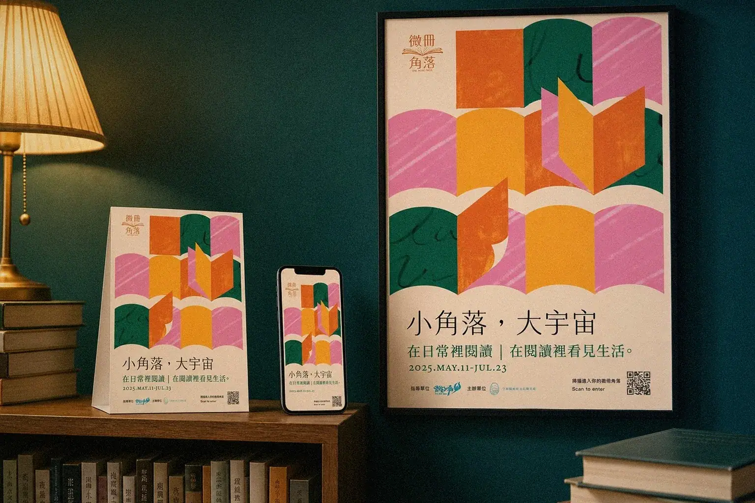
The Yunlin County Government's Department of Cultural Affairs and Tourism (雲林縣政府文化觀光處) runs a reading-for-all brand called 'Weice Corner' (微冊角落). Howdy Creative designed the key visual for its annual reading campaign, 'A Little Corner, A Big Universe,' using layered paper-cut book pages to form mountains and planets, then extended it across posters, flyers, and mobile pages.
Challenge
The client wanted a warm, hand-drawn reinterpretation of the 'Weice Corner' brand that incorporated the existing open-book logo motif into the key visual, giving concrete, warm visual form to an otherwise abstract reading-promotion slogan, 'A Little Corner, A Big Universe.' The visual also had to support posters, flyers, a mobile guide page, and a website across multiple sizes, rather than working as a single standalone event visual.
Goal
Early in the proposal stage, two clearly different directions were presented to align with the client: one clean and understated, emphasizing a humanistic quality, and the other using a denser layout to convey local vitality, with room to extend into a store map guide. The goal was to converge on a final key visual that could represent the logo's meaning, the tone appropriate for a government agency, and the warmth of the campaign, while staying consistent as it extended across different media.


Approach
- Presented two directions, A and B, for the client to compare: Direction A used a clean arrangement of warm color blocks to emphasize a humanistic quality, while Direction B let the 'little corner' motif burst with local vitality in a denser layout that could extend into a store map guide.
- Based on the client's feedback, wanting a warm, hand-drawn style that incorporated the 'Weice Corner' open-book logo motif, went through multiple rounds of illustration revisions, including an attempt at depicting everyday reading scenes through mountain and character illustrations.
- Finalized the visual as an abstract paper-cut collage: warm tones of terracotta orange, berry pink, and deep pine green layered into page-like mountain forms, paired with planet and star motifs to give concrete form to the 'A Little Corner, A Big Universe' theme.
- Extended the finalized visual across posters, flyers, and a mobile QR-code guide page in multiple sizes, while preserving the standard identity blocks for the supervising agency 'Yunlin Debuts' and the host agency, the Yunlin County Government Department of Cultural Affairs and Tourism.

Outcome
The key visual was finalized in 2025 and applied across the posters, flyers, and mobile QR-code page for the 'A Little Corner, A Big Universe' reading-for-all campaign (May 11 to July 23, 2025), unifying the 'Weice Corner' brand identity with the campaign's visual tone, and serving as a foundation for the department's later reading-promotion materials.
Questions people ask
about projects like this.
For a government reading-promotion campaign, how do you balance identity extensibility with the campaign's emotional warmth?
Howdy Creative typically starts by clarifying how the existing brand logo's motif should carry into the key visual, then layers illustrated elements to build a warm, tactile feel. Poster, flyer, and mobile page sizes are all confirmed early in the design process, so the finalized visual stays legible and doesn't break when extended across formats.
How do you typically align with a client on direction before finalizing a key visual?
We usually present at least two clearly distinct directions for comparison, for example a clean, understated block arrangement versus a denser, illustration-driven layout emphasizing local vitality, then converge based on the client's feedback round by round, avoiding endless revisions that never settle on a direction.
← Previous:One City, Twenty Faces: Integrating Yunlin County's Township Communication Design
The next red thread