From a Penguin Mark to a Color System: Yani Vitality's Brand Identity Overhaul
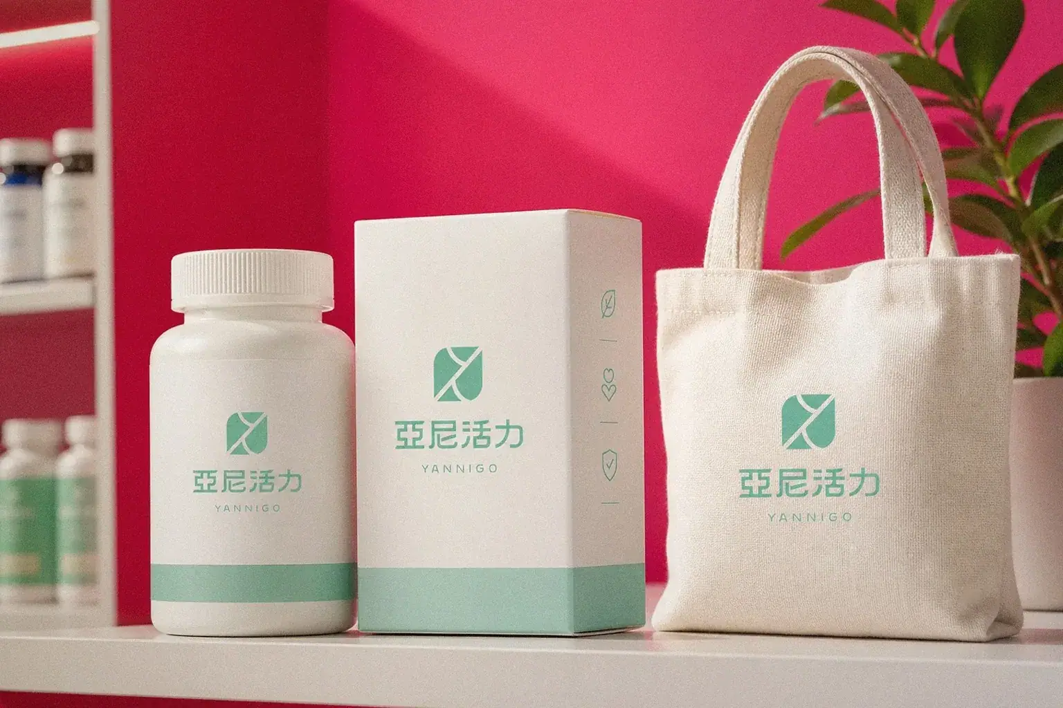
Yani Vitality (亞尼活力 / YANNIGO) was founded in 2003 as Taiwan's first prenatal and lactation nutrition brand. Howdy Creative helped rebuild the brand's DNA, designing a new mark built from two penguins nestled together and establishing a complete identity system.
Challenge
Yani Vitality has been operating for more than two decades, growing from prenatal and lactation nutrition products into a full range of health supplements for women, men, and every age group, with markets expanding from Taiwan into Hong Kong, Macau, Singapore, and China. As the brand's story and positioning kept growing, its existing identity system could no longer carry the warmth and sense of companionship the brand wanted to express, and it needed a system that could distill the brand's core again while supporting a much wider range of future applications.
Goal
Through a brand workshop, first work with the Yani Vitality team to clearly articulate who the brand is and who it serves, establishing its vision, mission, and core values. Then translate that brand spirit into a concrete, memorable visual identity that could extend across every application, including the logo, standard colors, supporting graphics, and a complete identity system guideline.
Approach
- Worked with the Yani Vitality team through a brand workshop to clarify the brand vision, 'Leading with heart, always by your side, embracing health inside and out,' establishing sincerity, health, and trust as the three core values guiding the identity design that followed.
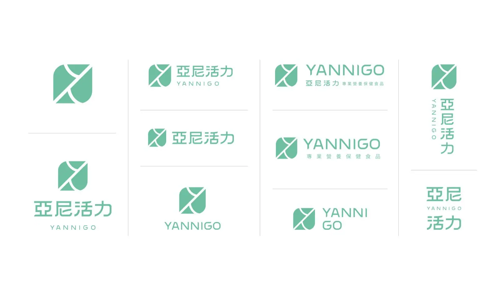
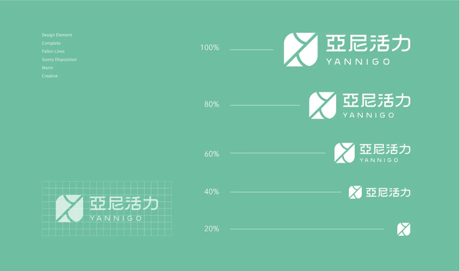
- Built the mark around two penguins nestled together, symbolizing companionship and care. The penguins' silhouette also echoes the shape of a tablet, connecting the mark to the supplement industry, and from it developed the standard colors, grayscale variants, and vertical and horizontal lockups.
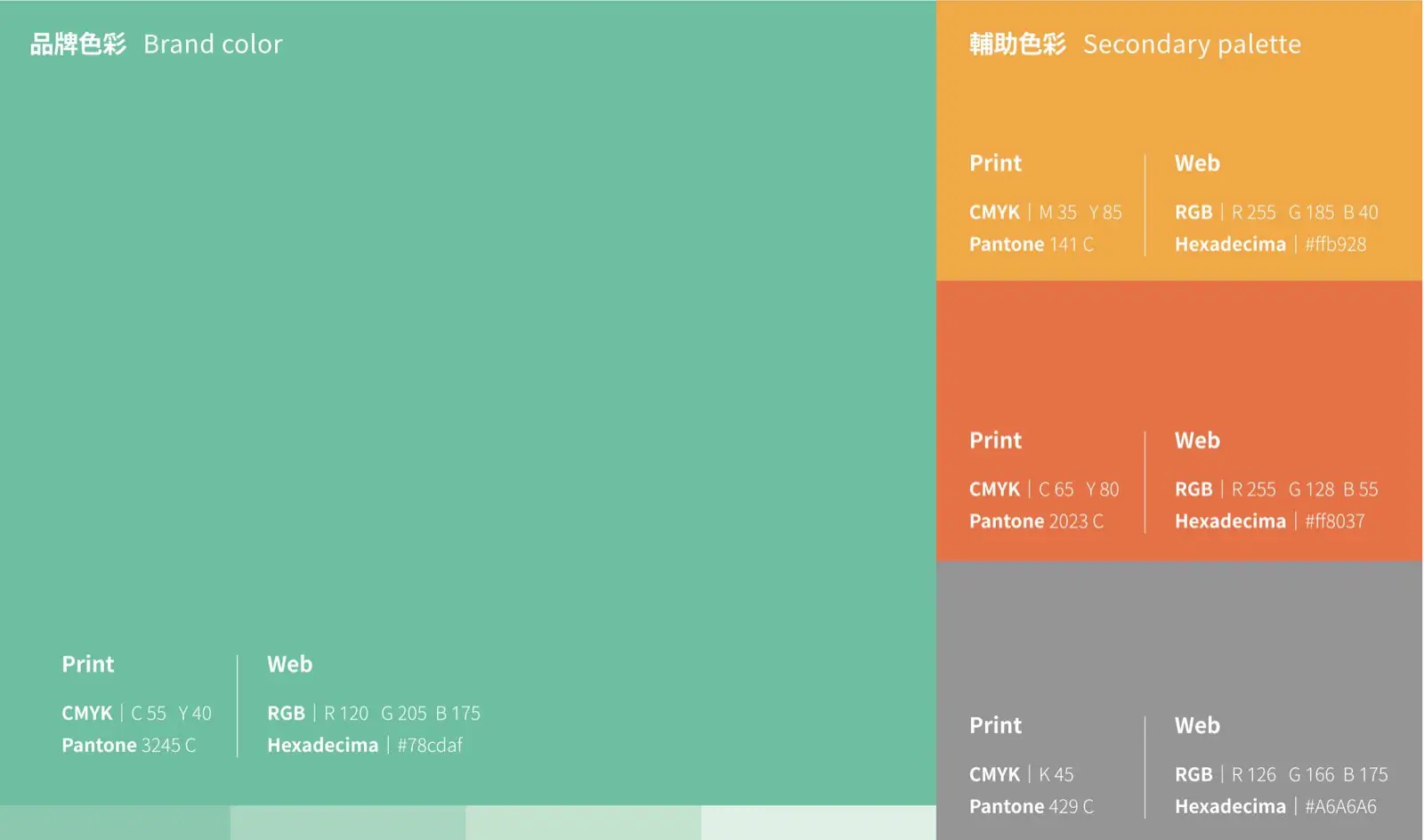
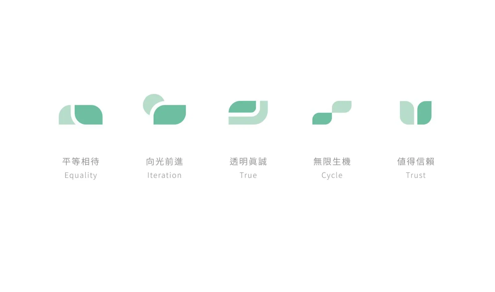
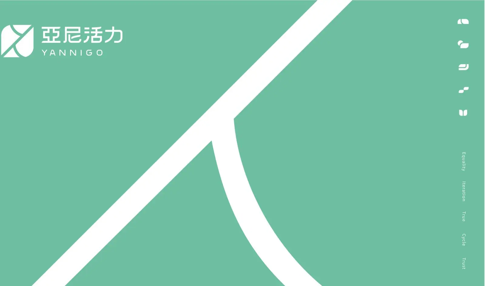
- Established Yani Vitality Green (Pantone 3245C) as the brand's primary color, paired with warm orange, warm yellow, and a grayscale support palette along with an abstract supporting graphic language, then consolidated everything into the CIS identity guideline and Company Profile.
Outcome
Yani Vitality now has a complete identity system spanning brand story, color system, and logo proportion guidelines, delivered as formal CIS identity guideline and Company Profile documents, giving the brand a clear, consistent visual reference from internal communication through to its public image. Howdy Creative has since continued working with Yani Vitality on strategy discussions around AI applications and a concept store, staying alongside the brand into its next stage.
Questions people ask
about projects like this.
How does a health supplement brand typically approach a brand identity redesign?
Howdy Creative usually starts with a brand workshop, working with the client's team to articulate the brand's vision, mission, and core values before moving into the logo, colors, and supporting graphics. This ensures the identity is not just visually appealing but genuinely carries the brand's story.
Why does a brand mark's form need to carry meaning rather than just look good?
A meaningful form lets the mark carry both the brand story and the industry it belongs to. Yani Vitality's mark is built from two penguins nestled together, echoing the brand's core value of companionship, while the penguins' shape also resembles a tablet, connecting the mark directly to the supplement industry so it functions as more than decoration.
Related links
- 亞尼活力 YANNIGO 官方網站客戶官方網站
← Previous:One Bento Box, One Railway Town: Product Design for Naoting Bento
The next red thread