Restaging the Magic of French Pastry: A Brand Identity for Meet Mi Patisserie
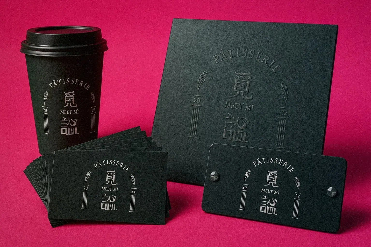
Howdy Creative redesigned the brand identity for Meet Mi Patisserie, drawing on the founder's training at Japan's Tsuji Confectionery school and Le Cordon Bleu to build a custom brand typeface and a matching web visual language.
Challenge
Meet Mi Patisserie's founder trained rigorously at Japan's Tsuji Confectionery school and Le Cordon Bleu, building a deep technical foundation, but the brand's existing visual identity didn't reflect that craftsman's journey or fully capture the charm of the pastries themselves.
Goal
The client wanted a brand identity redesign that would bring the visual identity closer to the pastries' pastoral French style, while building a distinctive, story-driven brand typeface and web presence that would strengthen the brand's memorability and positioning.
Approach
- Started from the founder's craftsman training background, using that story as the core vocabulary and design cue for the identity work.
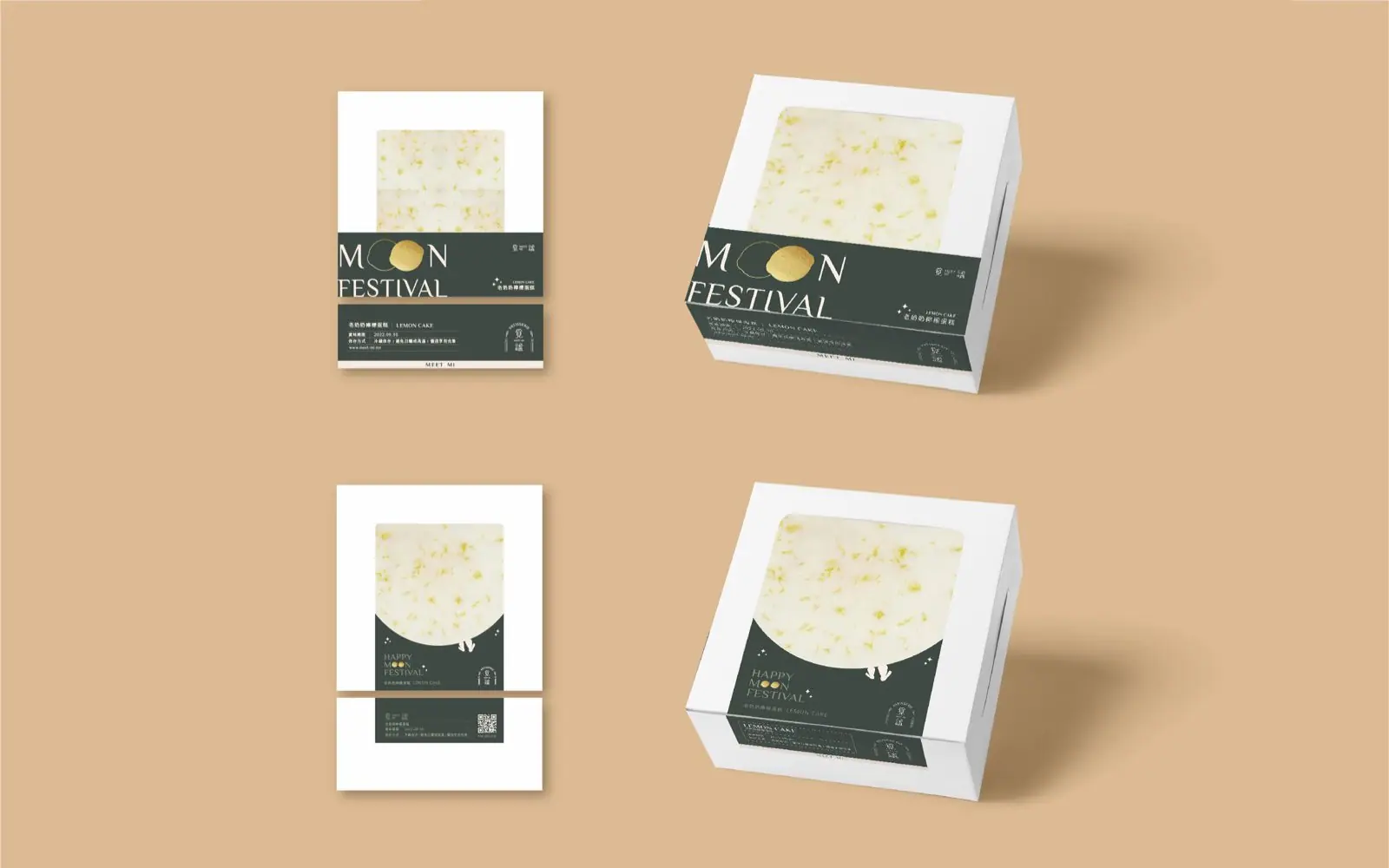
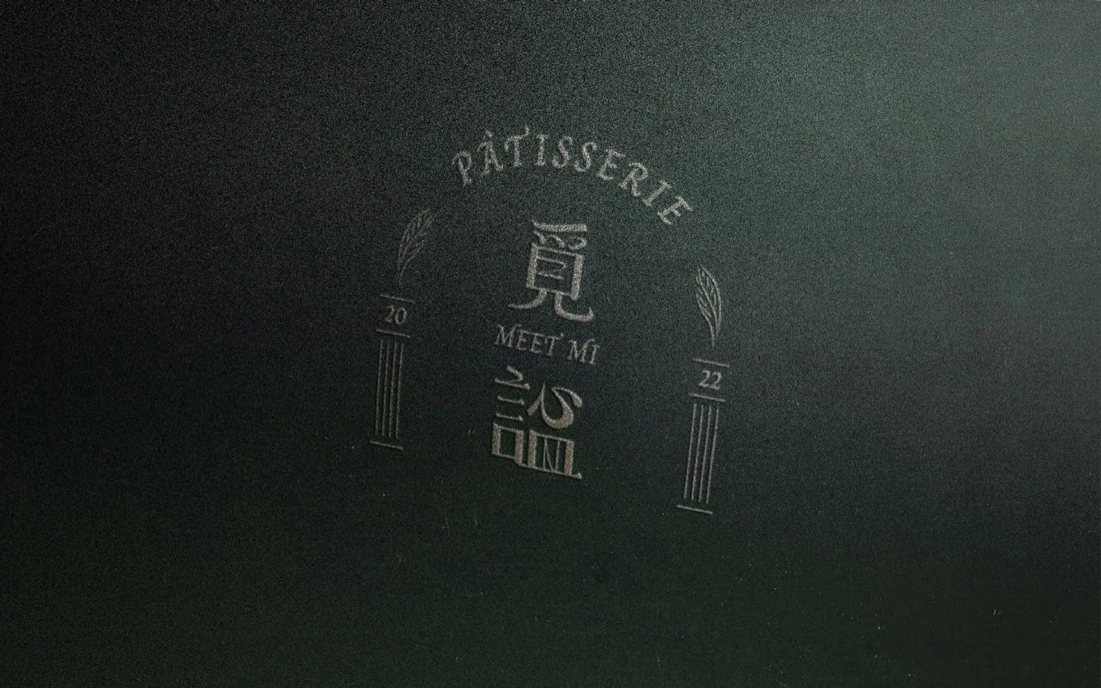
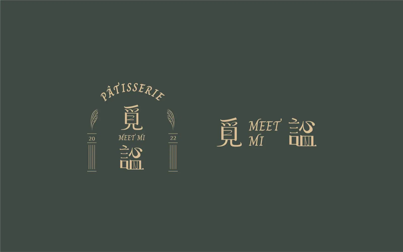
- Designed a custom brand typeface and identity features that echo the warm, refined tone of pastoral French pastry and the brand's distinct character.
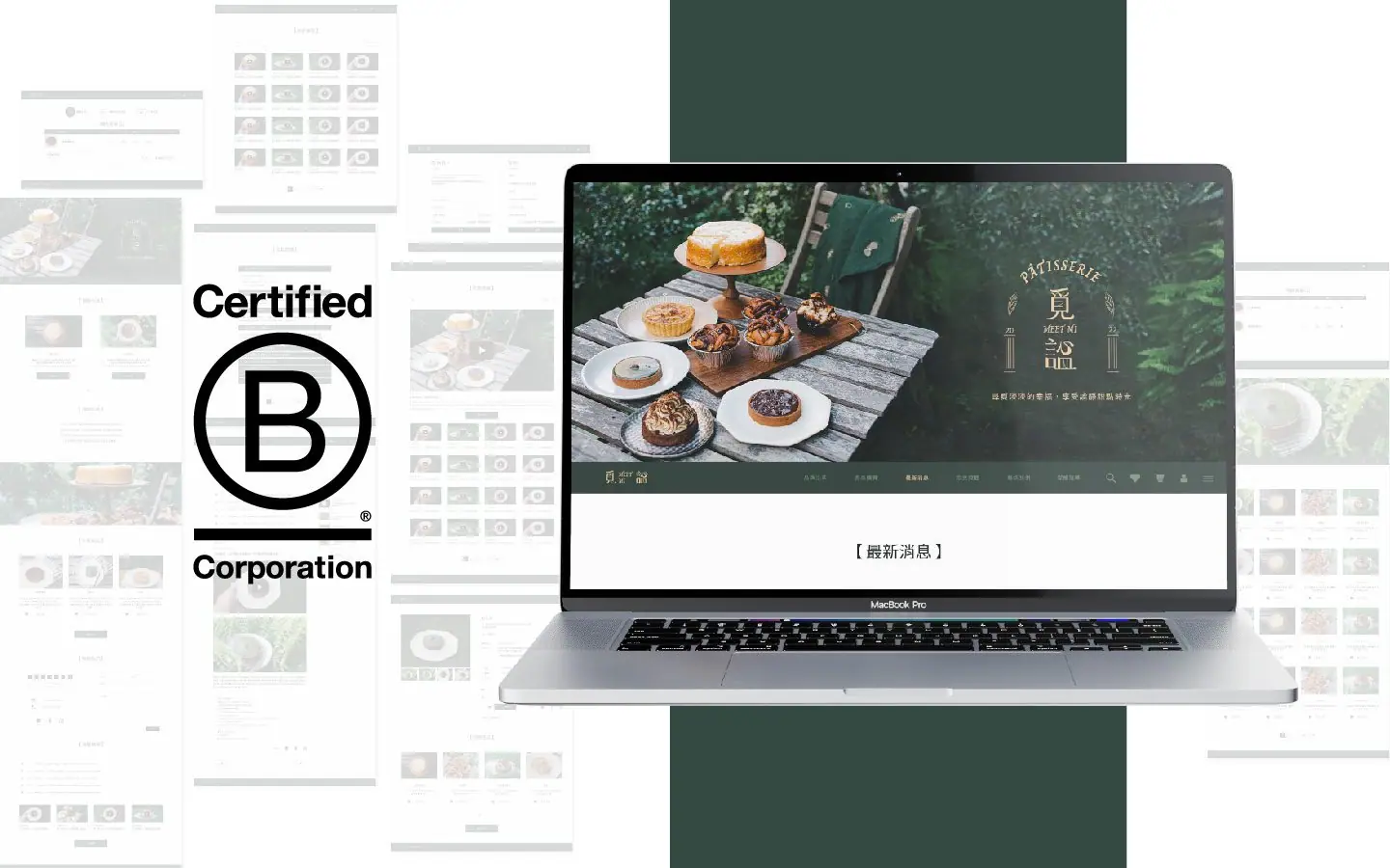
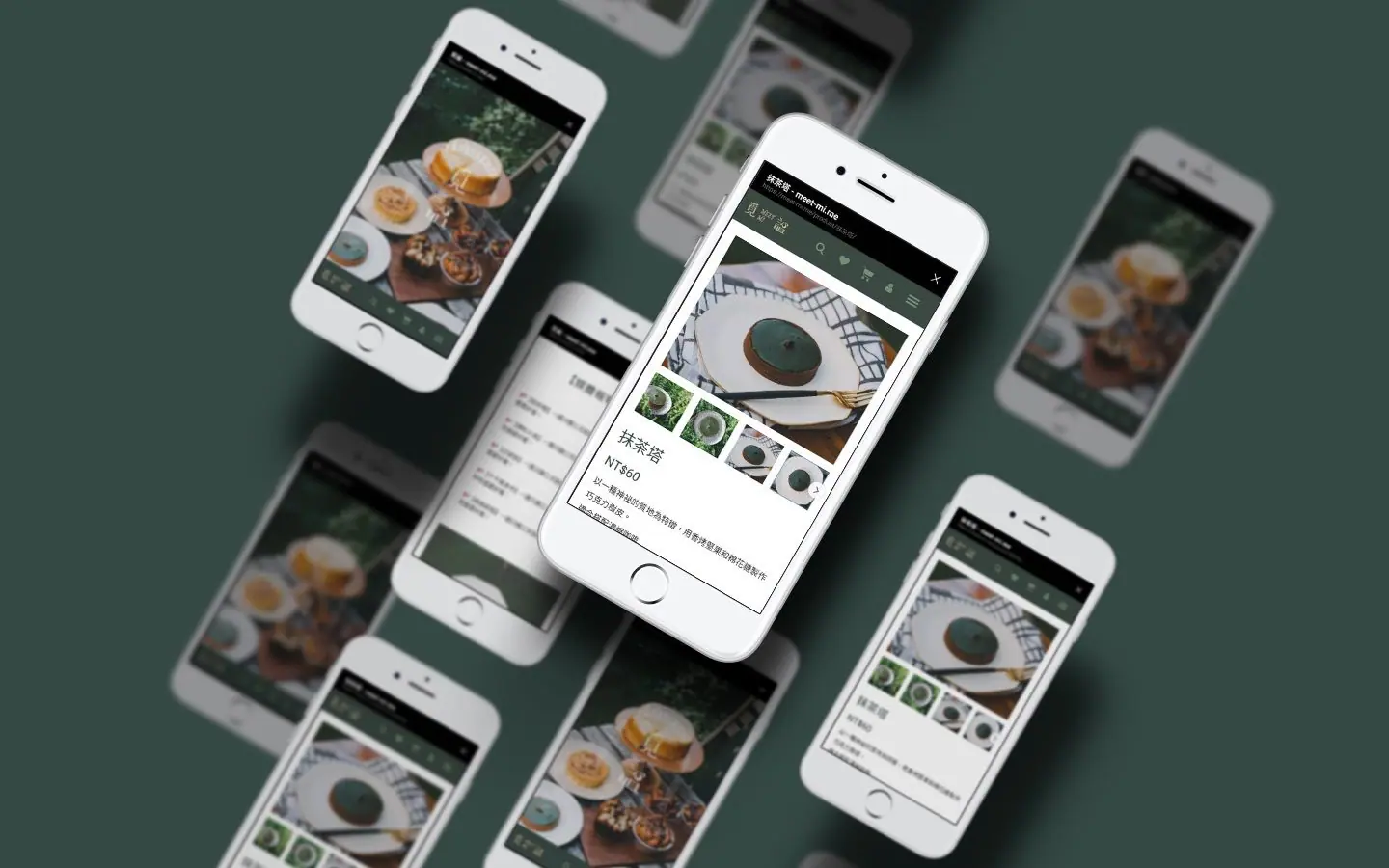
- Extended the identity system into web design, so the online browsing experience carries the same quality and detail as the brand visuals.
Outcome
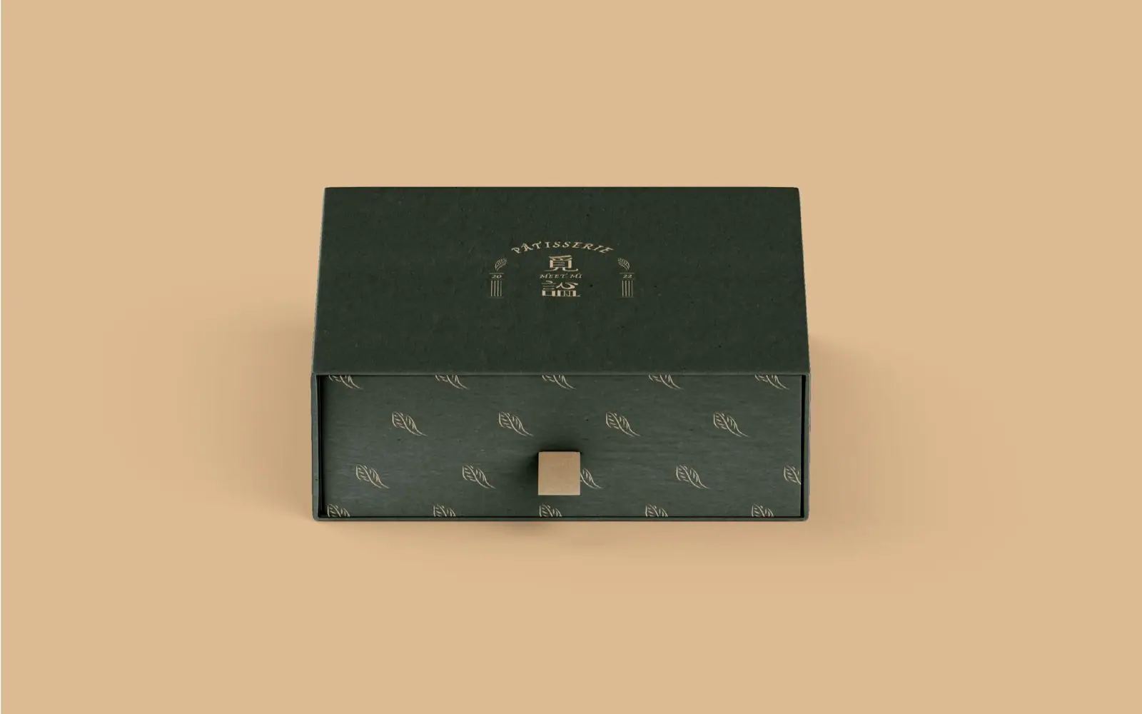
Meet Mi Patisserie's brand typeface, identity features, and website are complete, connecting the visual identity to the founder's craftsman background and the pastries' own style, and building a more complete, story-driven brand image and positioning.
Questions people ask
about projects like this.
What does a patisserie brand identity project typically include?
It usually covers the logo and typeface, a color system, and applications like packaging or menus. Howdy Creative decides which applications to prioritize based on the founder's craftsman background and the pastries' own style.
Should the website be redesigned alongside a brand identity refresh?
It's worth planning together. The website is often a consumer's first touchpoint with the brand, and Howdy Creative carries the identity system's typeface and color work into the web design so the online and offline experience stay consistent.
Related links
- 覓謐法式甜點客戶官網
The next red thread