A Parent-and-Sub-Brand Logo System for Suai-A-Ka, Kaohsiung
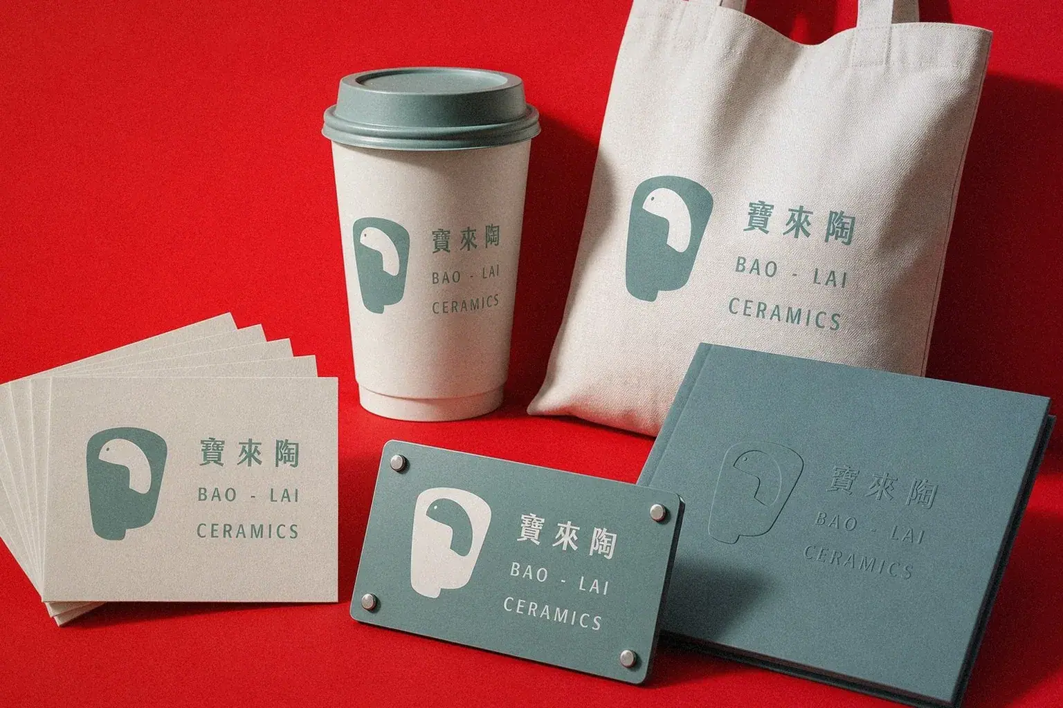
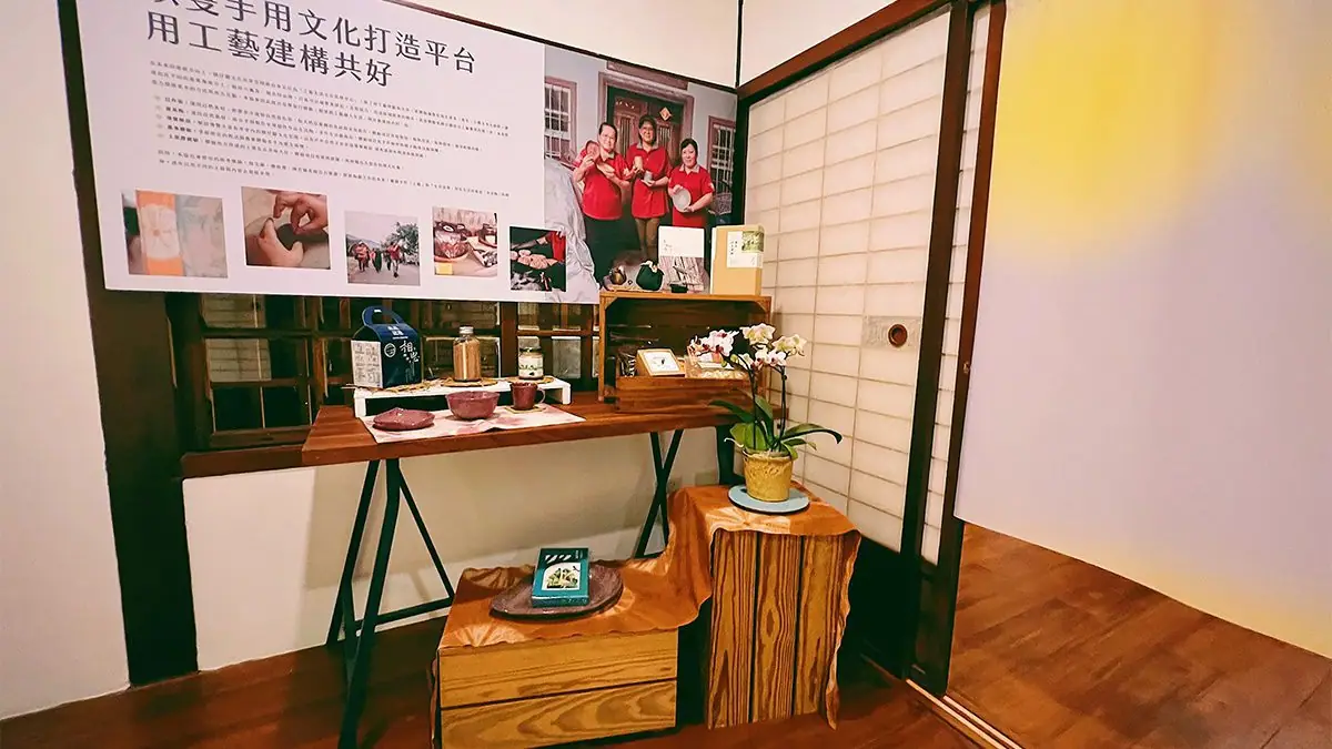
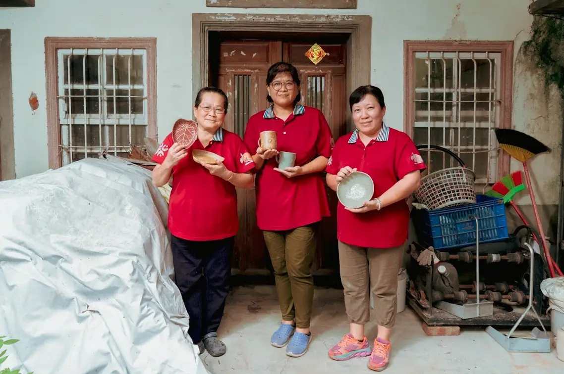
Howdy Creative rebuilt the brand for Suai-A-Ka Cultural Sharing Space, the craft hub run by the Bao-Lai Humanities Association in Kaohsiung, with a parent-and-sub-brand logo system that unifies the identity of its pottery, natural dye, and wood-fired bread lines.
Challenge
Suai-A-Ka Cultural Sharing Space runs three independent craft lines, pottery, natural dyeing, and wood-fired baking, that never shared a visual system. Outsiders couldn't tell the three belonged to the same Bao-Lai brand, and the fragmented look made long-term promotion difficult.
Goal
The association wanted a parent-and-sub-brand logo system where Bao-Lai Pottery, Nichisaku Dye, and Earth Kiln Bread each kept a distinct identity while still reading as part of Suai-A-Ka, with the handmade warmth of the pottery and dye crafts carried through the design.
Approach
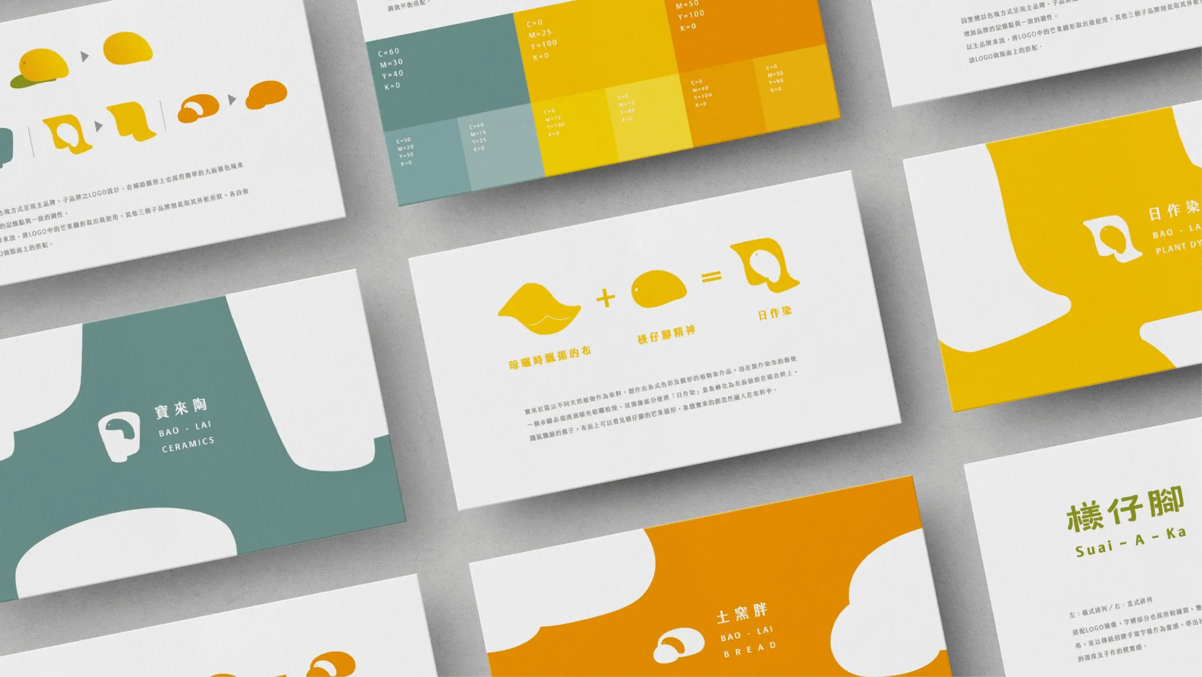
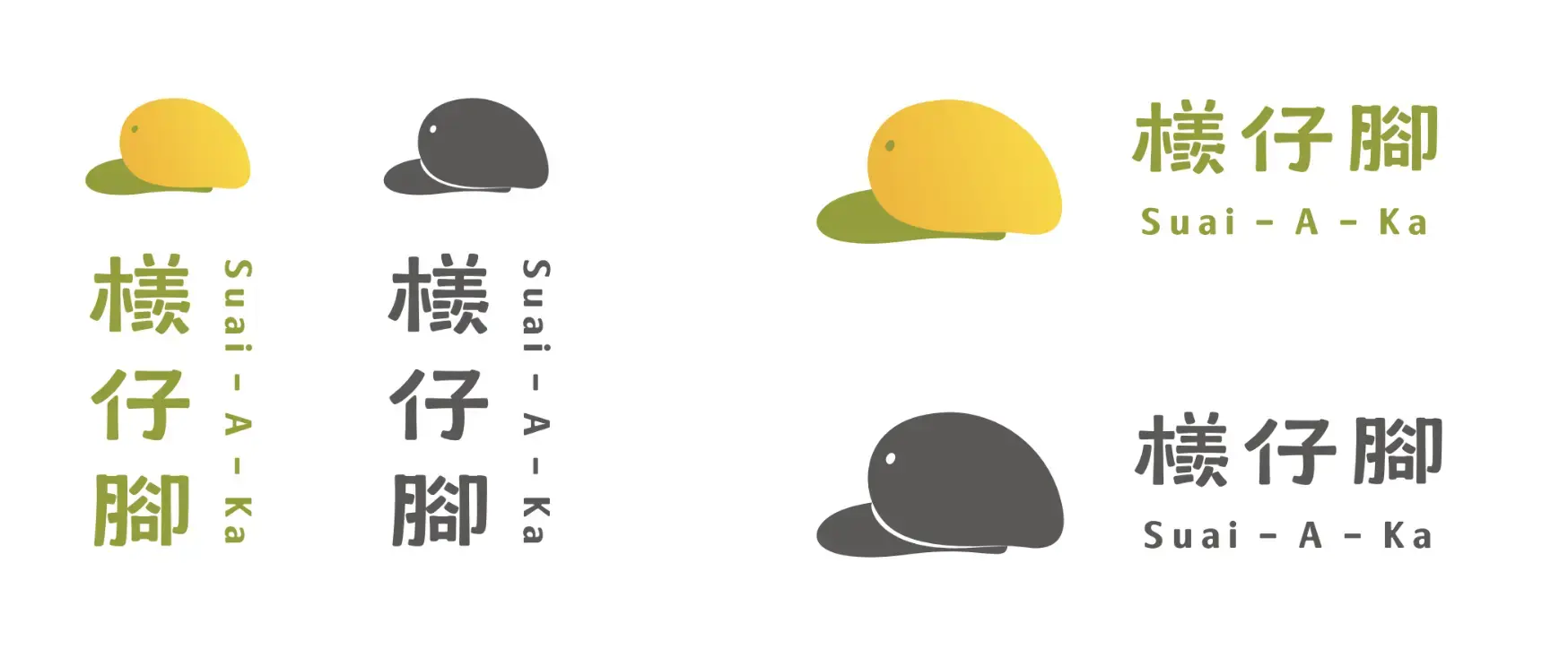
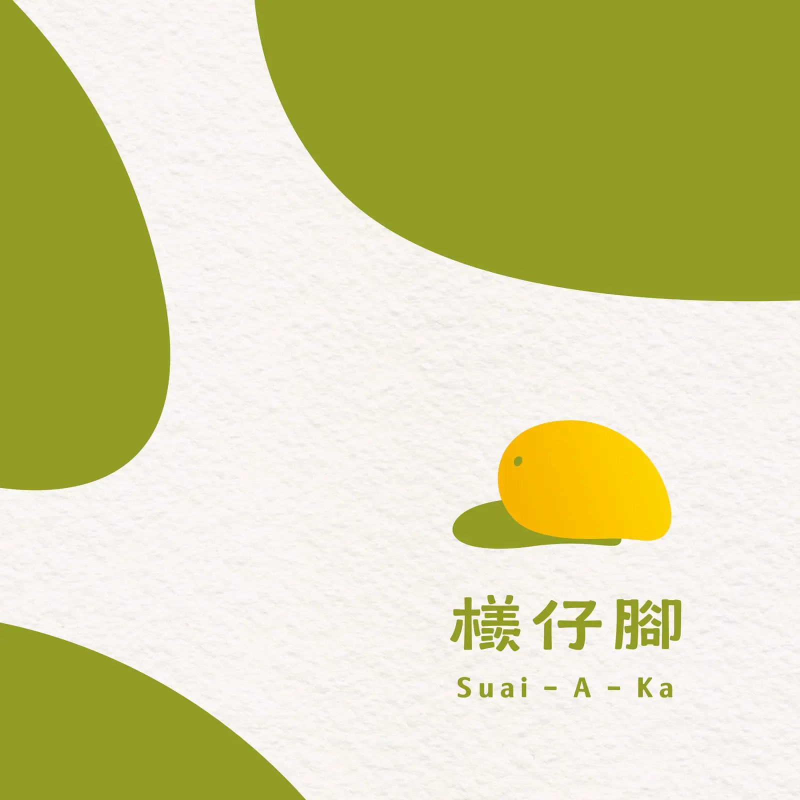
- Built the parent brand's key visual around a golden mango motif and an earth-toned palette, echoing Bao-Lai's local abundance and handmade texture.
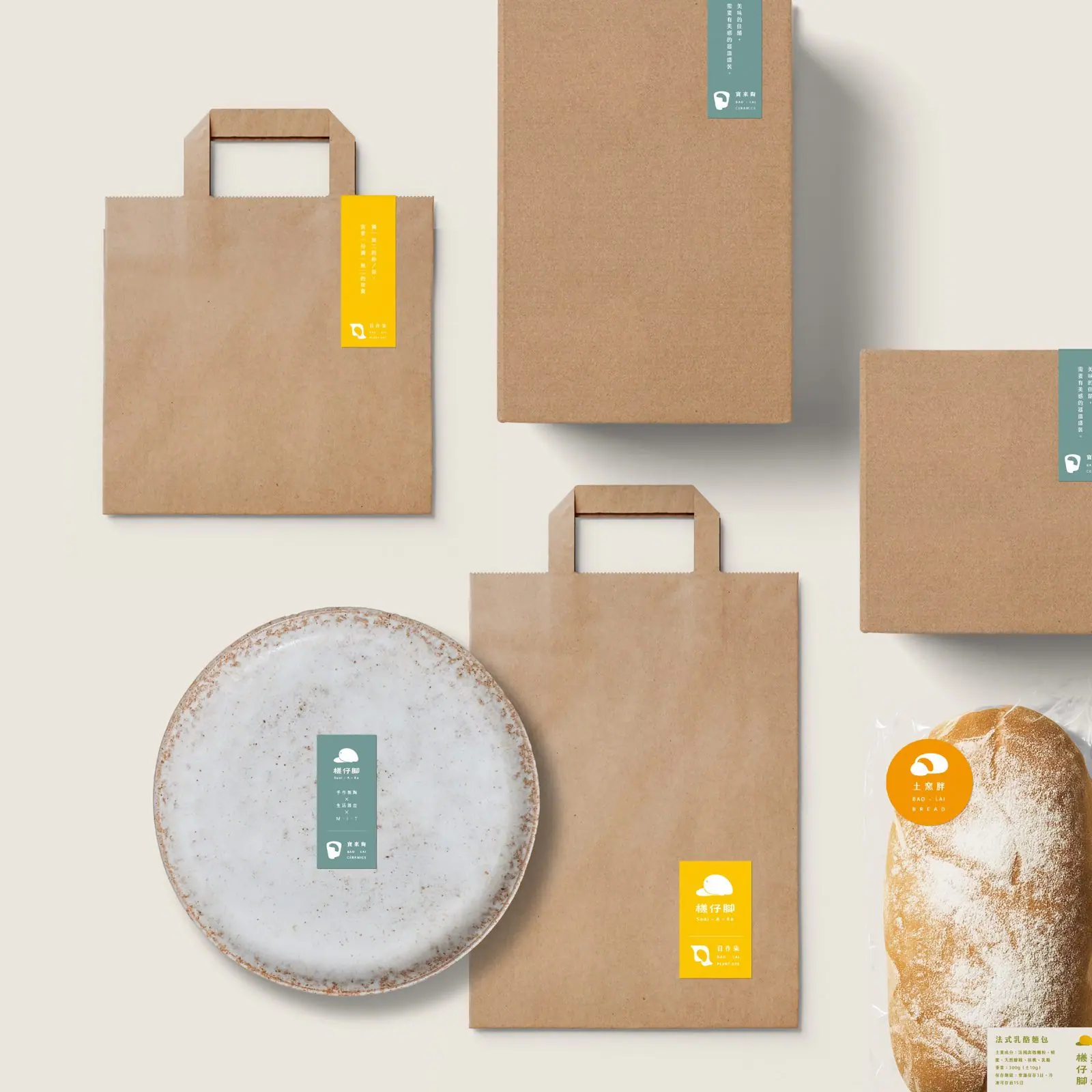
- Developed a distinct visual vocabulary for each sub-brand: pottery-making linework for Bao-Lai Pottery, flowing fabric imagery for Nichisaku Dye, and the rustic feel of longan wood and bread for Earth Kiln Bread.
- Unified the color and layout rules across parent and sub-brands, so all three lines read as individually distinct yet clearly part of one brand family.
Outcome
The parent-and-sub-brand logo system for Suai-A-Ka is complete: Bao-Lai Pottery, Nichisaku Dye, and Earth Kiln Bread each have their own visual language while together forming one consistent identity, making it easier for the association to promote its craft experiences.
Questions people ask
about projects like this.
What kind of brand is a parent-and-sub-brand logo system suited to?
It works well for an organization with several product lines or sub-brands that still needs one cohesive identity. Howdy Creative first defines the parent brand's core visual language, then develops distinct traits for each sub-brand, so every line stays recognizable on its own while clearly belonging to the same family.
Does a traditional craft brand lose its handmade warmth once it gets a formal identity?
Not necessarily. For Suai-A-Ka, Howdy Creative deliberately carried pottery-making linework and natural-dye fabric texture into the mark itself, so the professional identity system coexists with the craft's original warmth rather than flattening it.
Related links
- 檨仔腳文化共享空間官方網站寶來人文協會旗下品牌官方網站
← Previous:Luye Highland's Hot Air Balloon, Turned Into a Souvenir You Take Home
The next red thread