Photonics Brand Transformation: Building a Professional, Innovative Identity
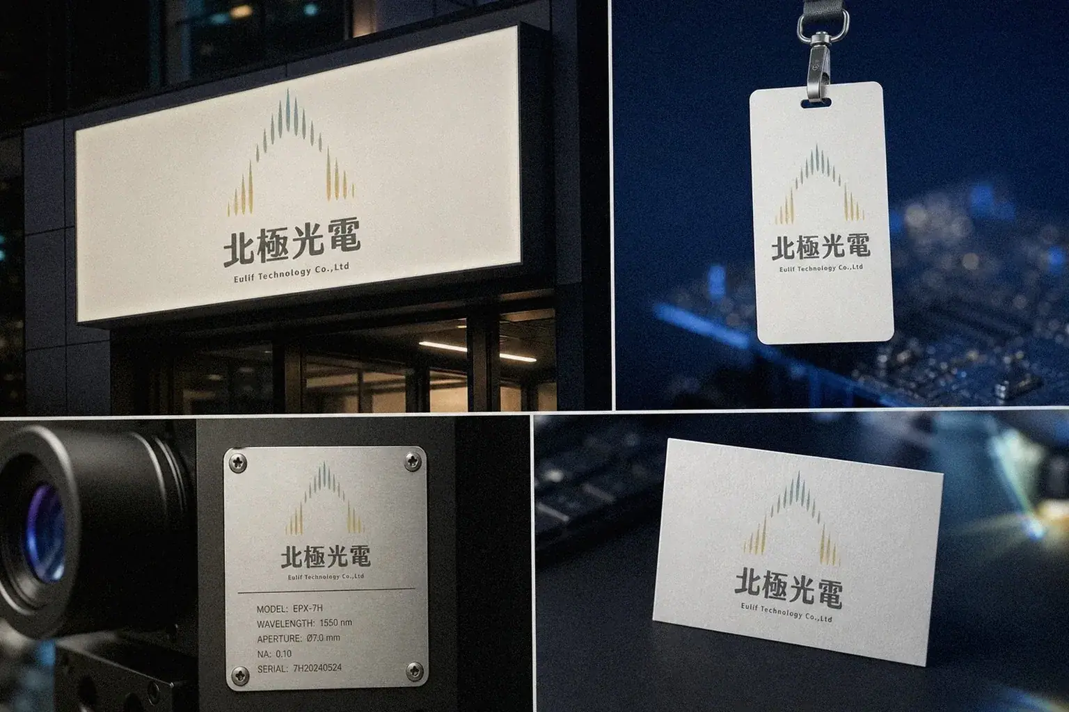
Eulife's original identity system felt dated. Howdy Creative built a new brand identity around the core imagery of light and electricity, redesigning the logo, wordmark, and color system so the company's visual presence matches its technical strength and forward-looking direction.
Challenge
Eulife has real technical strength in the photonics industry, but its existing identity leaned toward a traditional industrial style. The logo, wordmark, and color palette lacked a unified system, making it hard to communicate the company's technical edge and innovation through everyday touchpoints like business cards, envelopes, and letterhead, and harder still for potential partners to form an immediate sense of professional trust.
Goal
Redesign Eulife's logo, wordmark, and color system around the core imagery of light and electricity, and build a complete identity that could extend across business cards, envelopes, letterhead, and other office applications, bringing the company's visual presence in line with its photonics expertise.
Approach
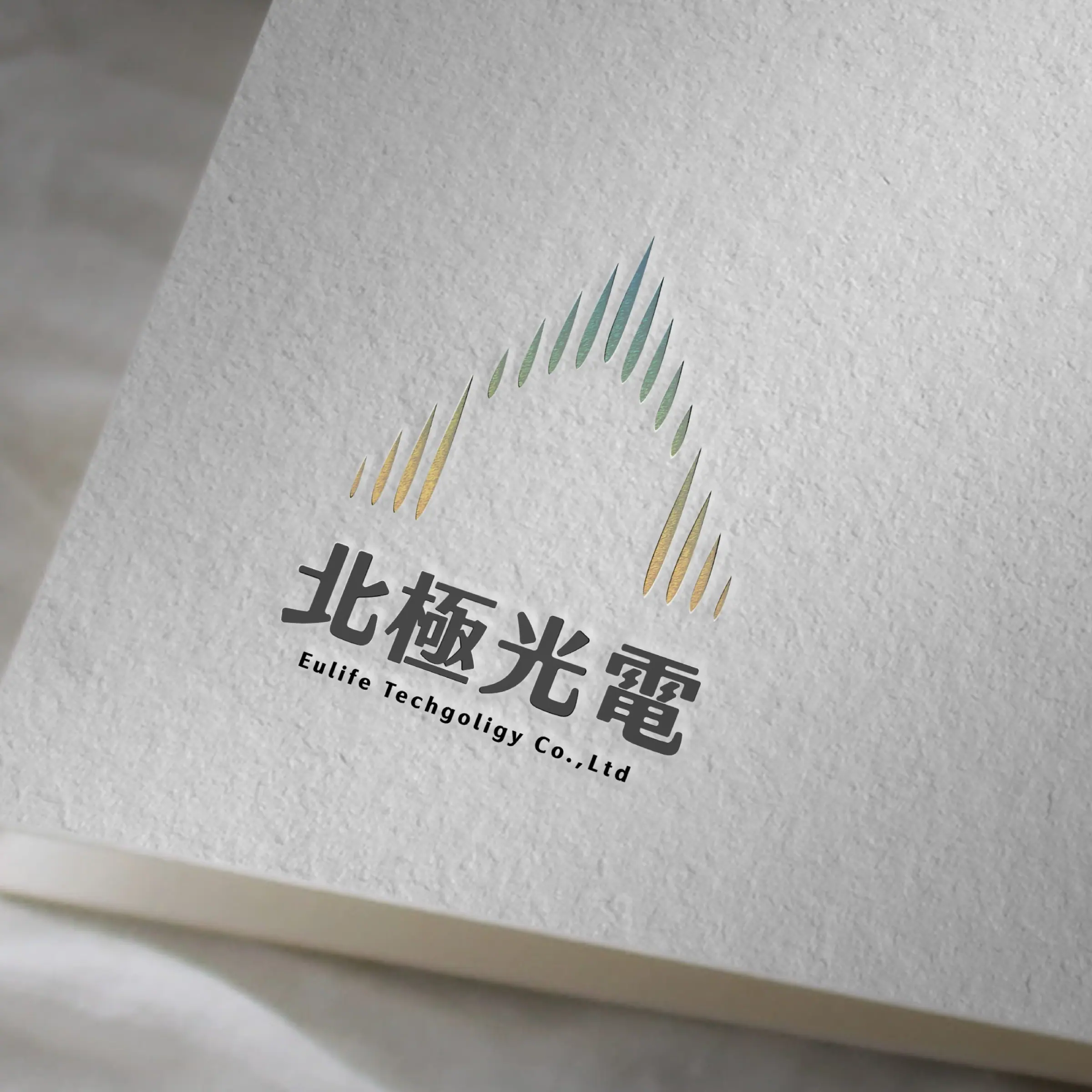
- Developed the logo form and wordmark from the imagery of light and electricity, replacing the previous, more traditional industrial visual language and repositioning the company's technical image.
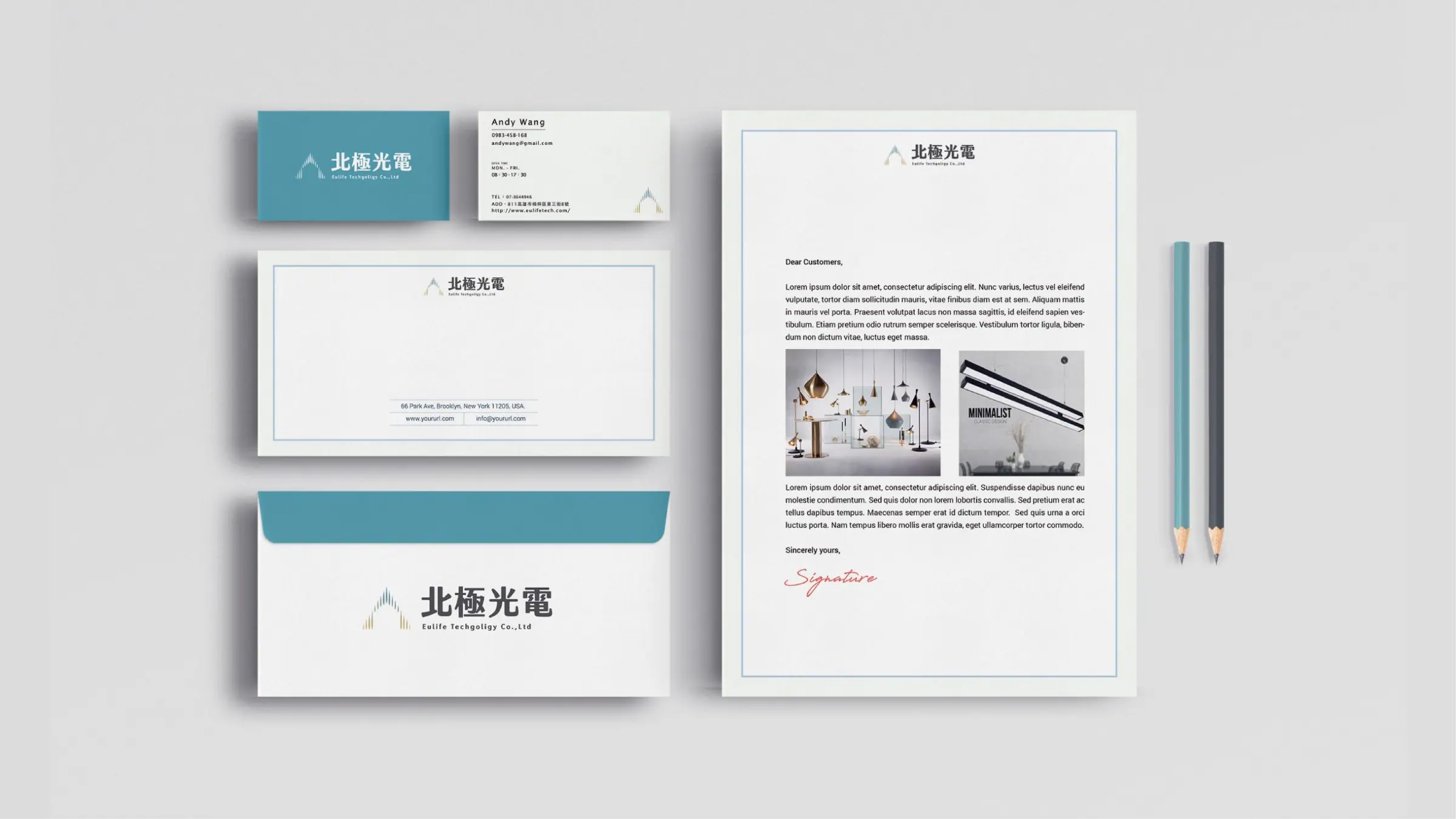
- Built a color system that runs consistently through the brand guidelines, governing the logo, wordmark, and every application so individual materials no longer went their own way.
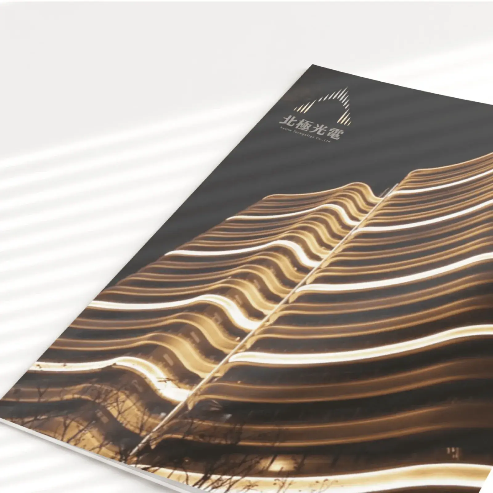
- Extended the identity across business cards, envelopes, letterhead, and other everyday office applications, unifying the look and feel of the company's outward-facing documents.
Outcome
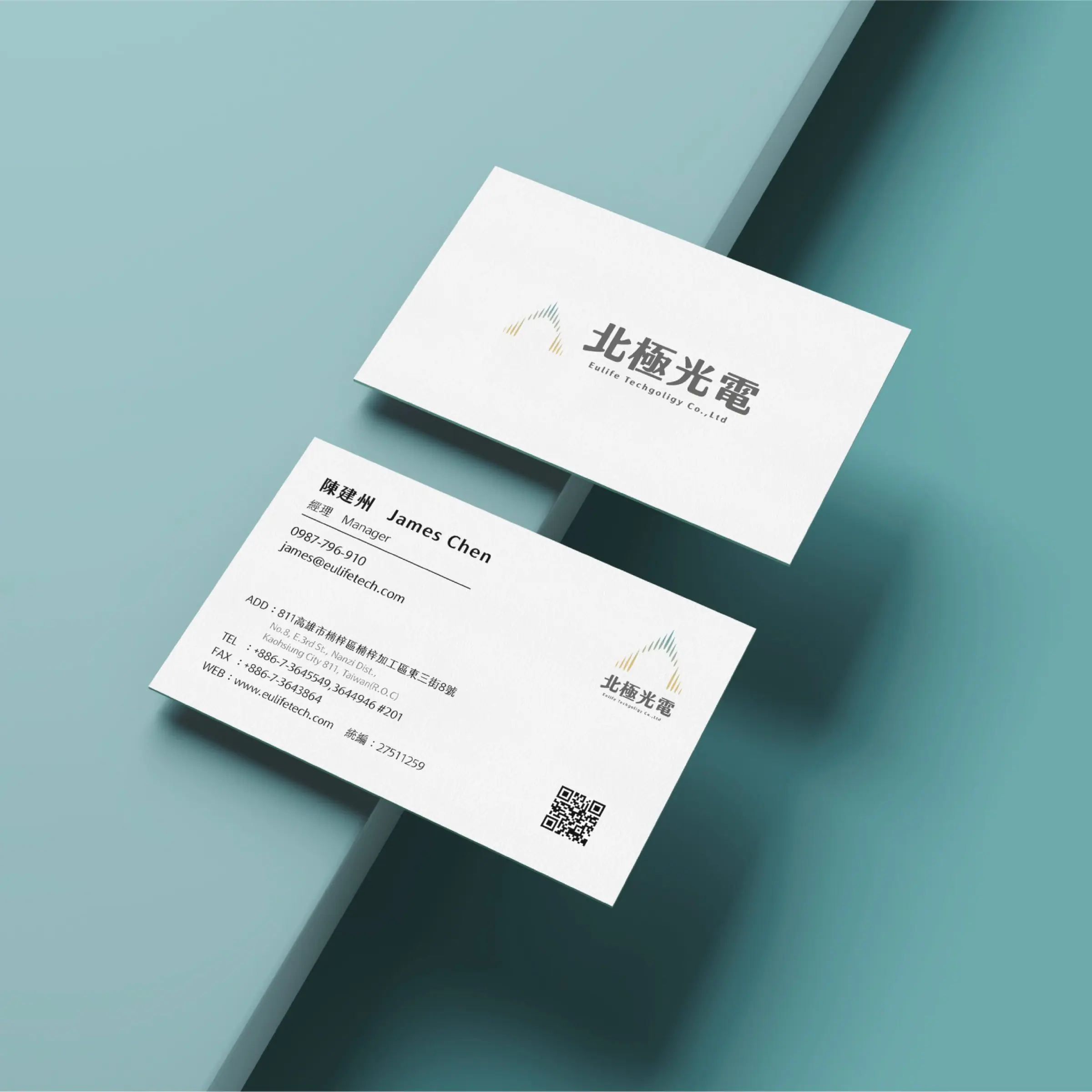
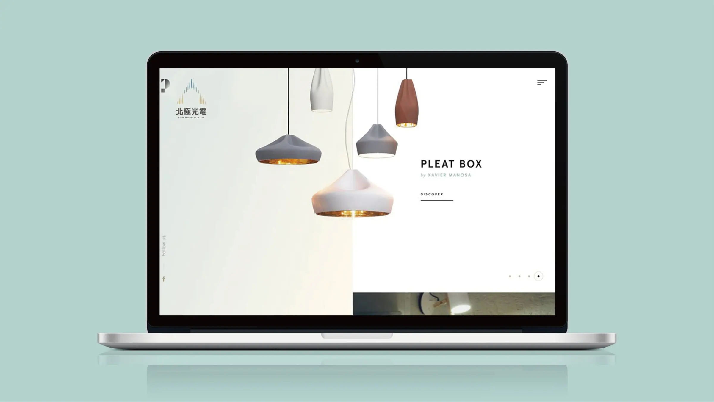
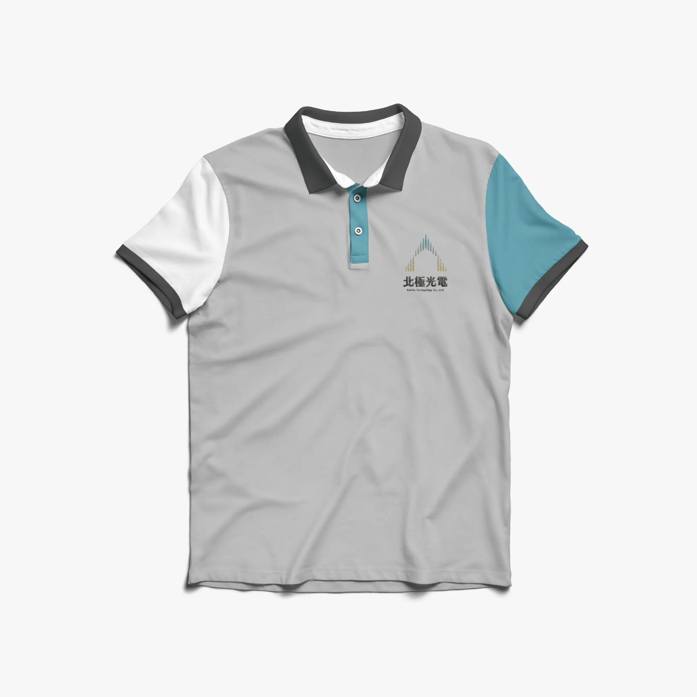
Eulife completed a new logo, wordmark, and color system and rolled it out across business cards, envelopes, letterhead, and other daily office materials. Every outward-facing touchpoint now shares a modern, consistent visual language aligned with the company's photonics positioning, giving its business dealings more credibility.
Questions people ask
about projects like this.
Where should a tech company start when building a brand identity?
We start by understanding the company's core technology and market position, then extract imagery that captures the brand's character, here it was light and electricity, before moving into the logo, wordmark, and color system.
Will redesigning an identity that feels too traditional risk losing existing customers' trust?
The rebrand keeps the industry positioning and core values customers already recognize, and upgrades only the visual language to something more contemporary. We compare directions with the client at proposal stage to keep the transition from feeling abrupt.
Related links
- 北極光電 Eulife客戶官方網站
← Previous:A Fortune Dragon for the New Year: Reviving Dragon Scales in a Red Packet
The next red thread