Designing With Heart: A Bread Brand Identity That Keeps Its Warmth
Brand IdentityPackaging DesignWeb Design
A preservative-free bakery that started at a farmers market needed a brand identity ready for its first storefront. We kept the warmth of a child's original drawing while rebuilding a consistent look across the logo, packaging, flyers, signage and website.
Challenge
Holyhome Country Bread grew out of baker Xiaolin's commitment to family and honest baking, building a following at local markets through preservative-free craftsmanship and local ingredients. The brand's logo was a child's drawing, a symbol of why the bakery started. But as the owner planned a first storefront and a wider audience, the lack of a systematic visual identity made it hard to communicate that pure, honest flavor clearly. The challenge: professionalize the brand without losing the emotional story behind it.
Goal
Build a complete, recognizable brand identity system. The new logo needed to carry the idea of a substantial gift and a sense of home, then extend across packaging, flyers, signage, business cards and the website into one consistent brand experience, folding in the meaning of the child's drawing rather than replacing it entirely.
Approach
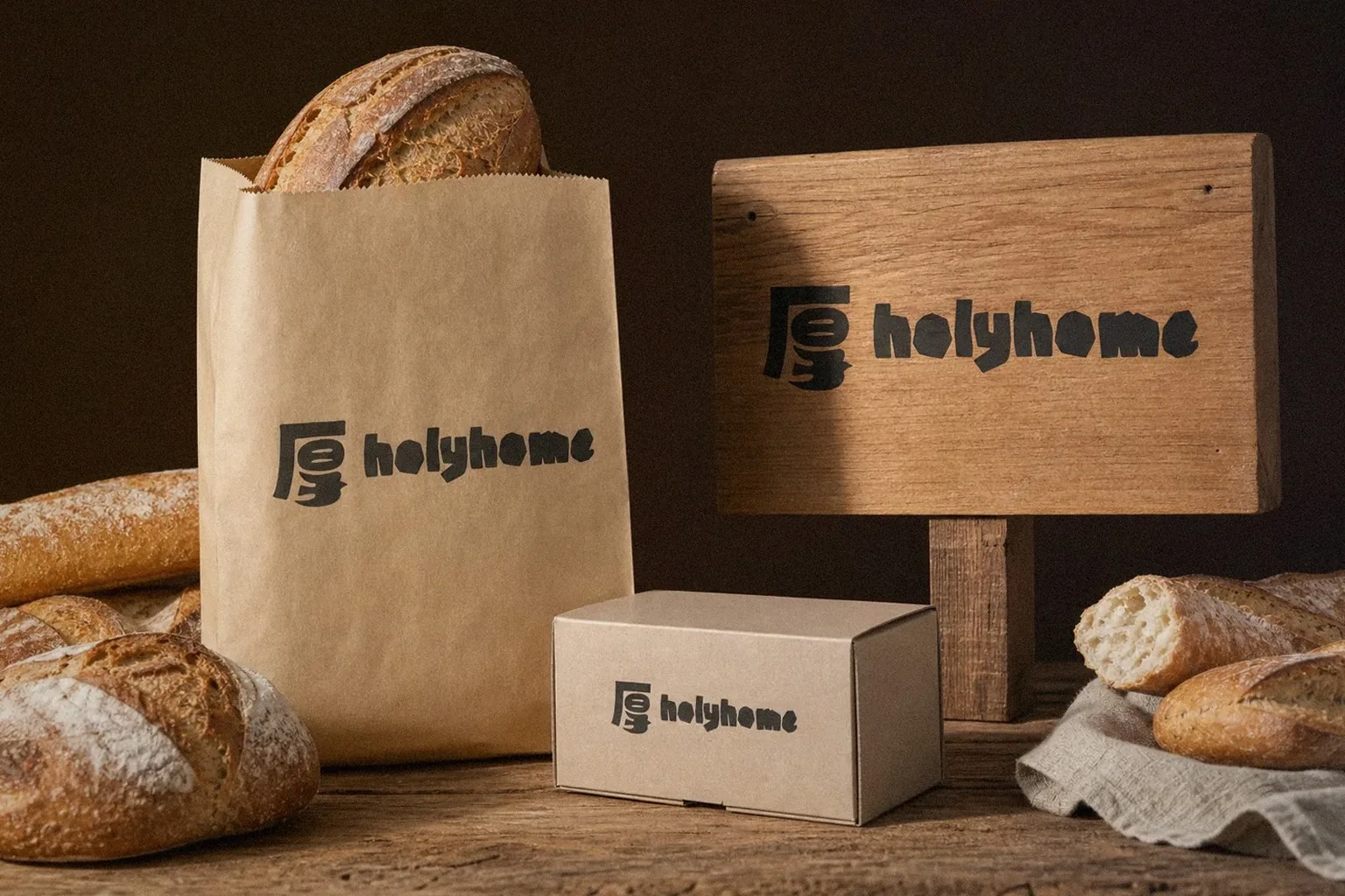
- Set the strategy as keep the heart, carry the warmth: turned the core Chinese character 厚 (generous, substantial) into a new mark with real weight, in earth tones that echo the bakery's rustic, natural character.
- Kept the child's original drawing alive through finer linework tucked into business cards and packaging details, and extended it into a visual motif for the physical space, so professional design and emotional history could sit side by side.
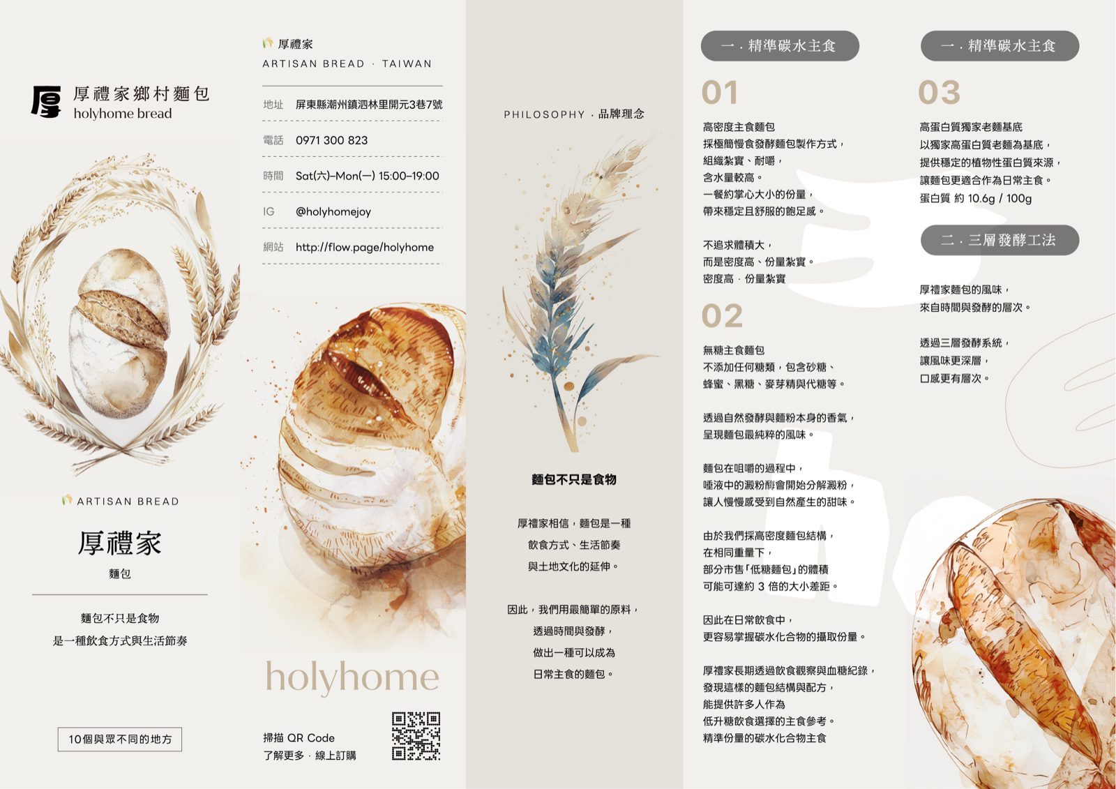
- Extended the identity across product packaging, a folded flyer, storefront signage and window decals, with a website design plan so the online experience carries the same warmth as the physical space.
Outcome
Holyhome Country Bread moved from a market stall to a storefront-ready brand: one identity system that stays consistent from logo to physical space, from print to web, so the values of preservative-free baking, local ingredients and family come through at first glance.
- Year2025
- ClientHolyhome Country Bread (厚禮家鄉村麵包)
- ServicesBrand Identity、Packaging Design、Web Design