Smart How: A Visual Identity System for a Smart Home Brand
Packaging DesignBrand Identity
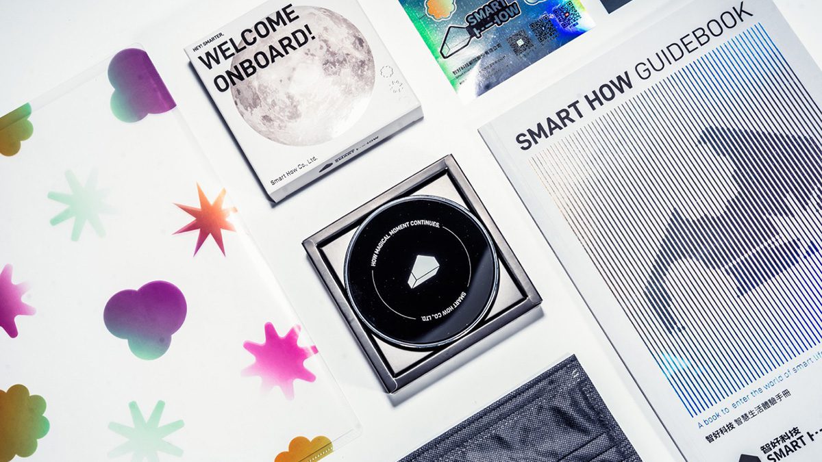
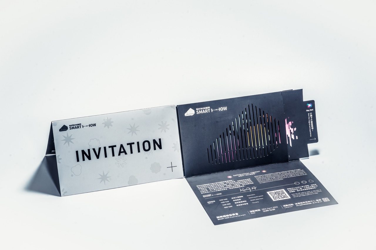
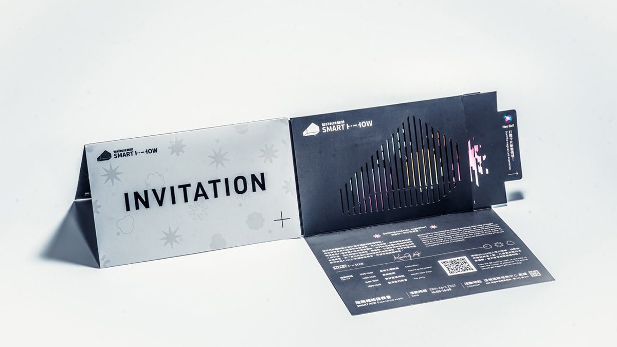
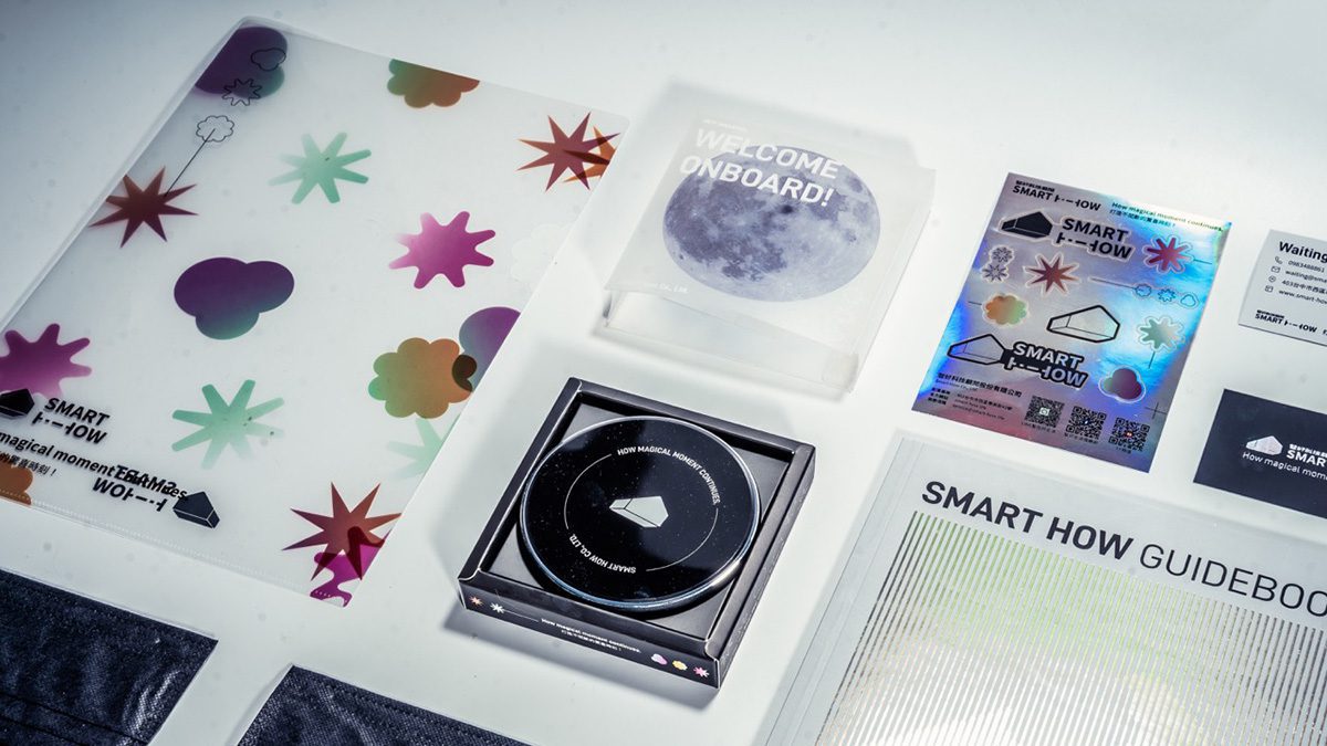
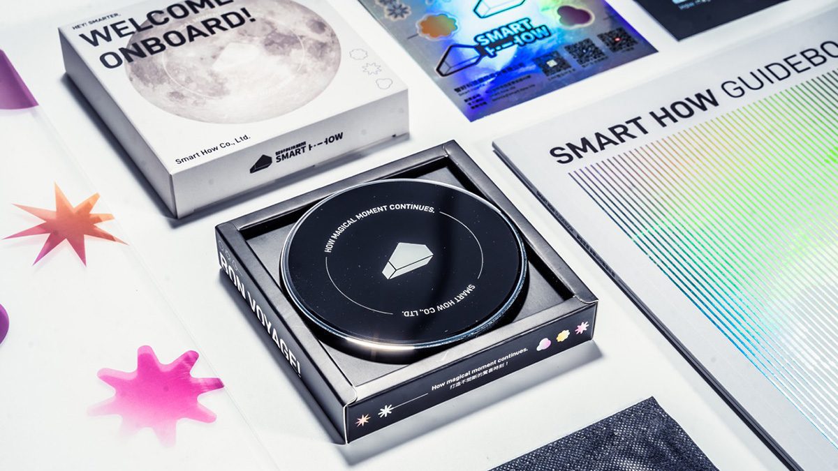
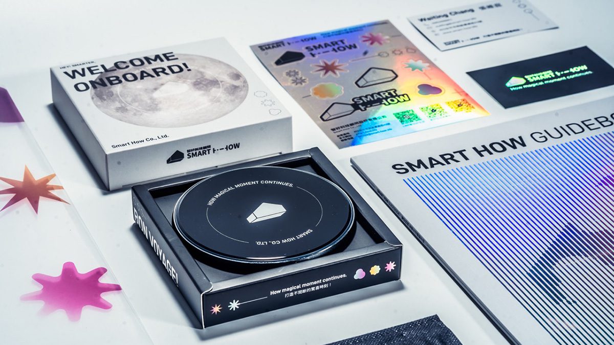
Howdy Creative built a visual identity system for Smart How (智好科技), a smart home consulting brand, resetting its logo, color system, and packaging applications to establish a consistent, professional image.
Challenge
Smart How positions itself as a smart home consulting brand, but its existing visuals had never come together as one system. The logo, colors, and packaging applications were all developed independently, making it hard to build a consistent, professional impression with consumers or to extend the design to future applications.
Goal
The goal was to build a complete visual identity system for Smart How, covering a finalized logo, color guidelines, and packaging applications, so the brand could maintain a consistent, professional tech feel across every medium, one the team could extend on its own later without the design drifting off-brand.
Approach
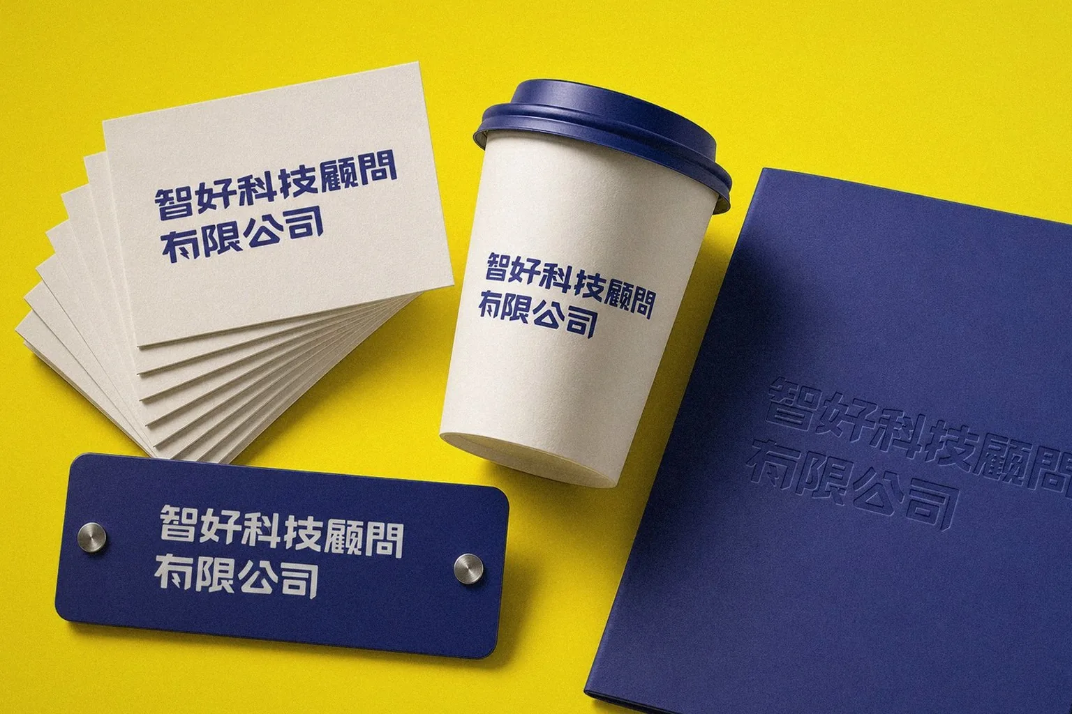
- Reset the brand's logo form and standard colors, establishing a visual identity foundation built to extend across future applications.
- Planned the packaging applications around the finalized identity system, so the product packaging stayed consistent with the brand logo.
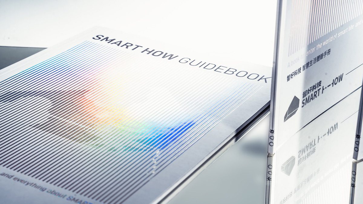
- Documented color and graphic usage guidelines so the team could extend the identity on their own later without the design drifting or breaking.
Outcome
Completed Smart How's visual identity system, delivering a finalized logo, color guidelines, and packaging application examples, giving the smart home consulting brand one consistent identity it can extend across every application.
- Year2024
- ClientSmart How (智好科技)
- ServicesPackaging Design、Brand Identity