A Packaging Redesign for Indigenous Products from Pingtung
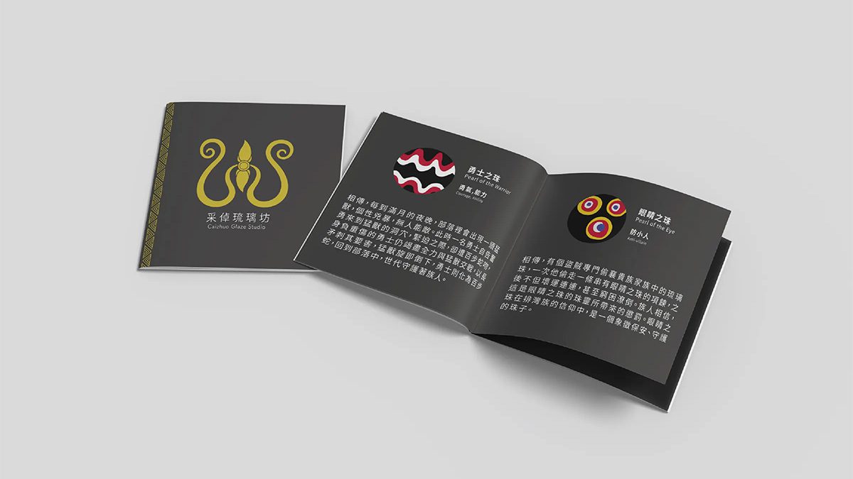
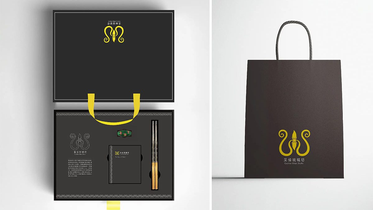
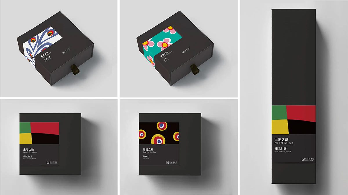
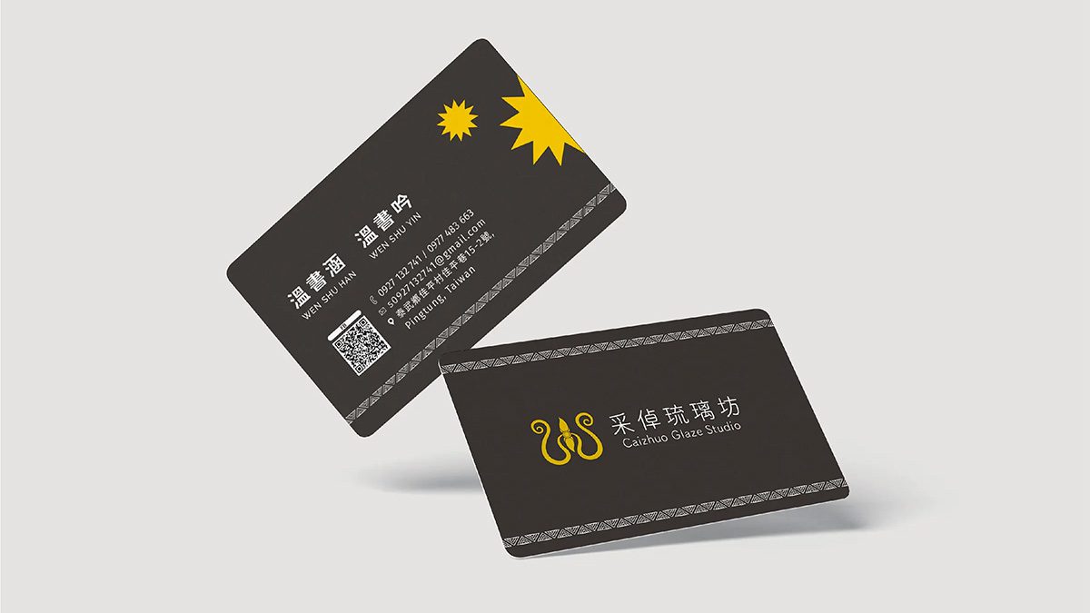
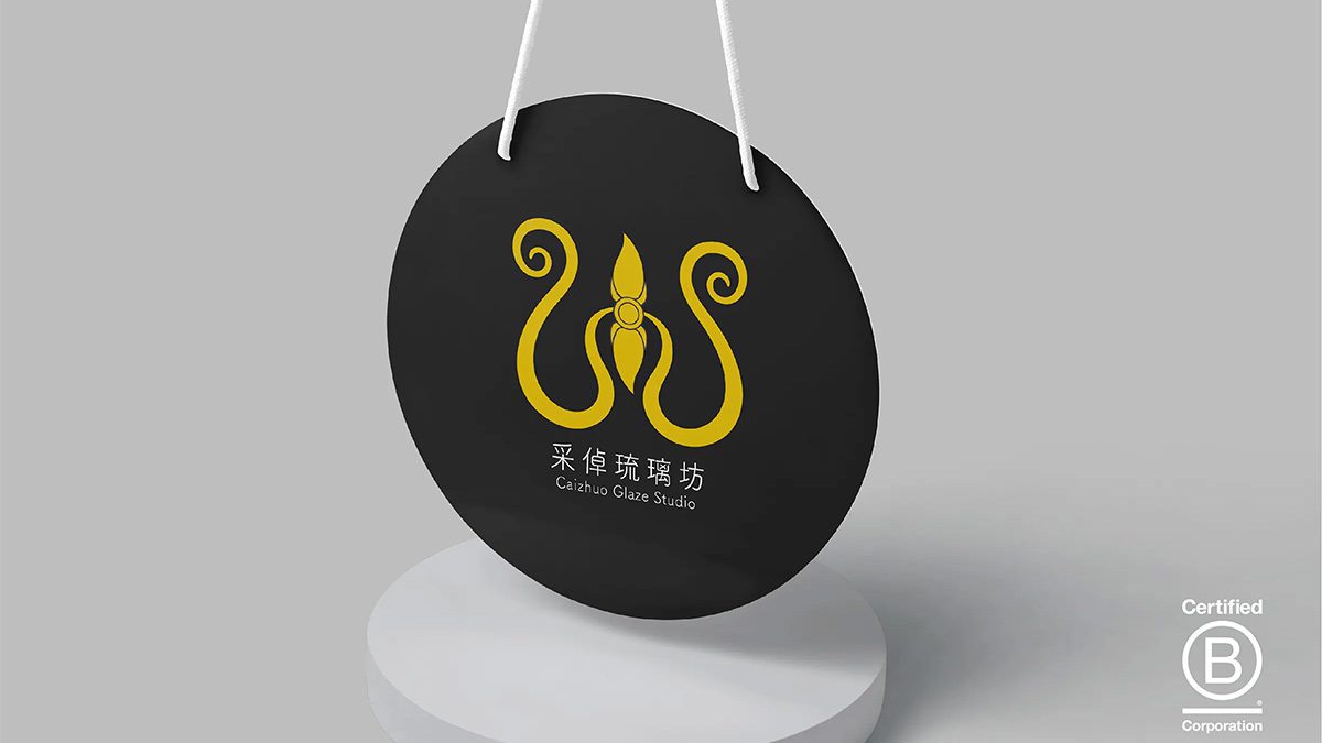
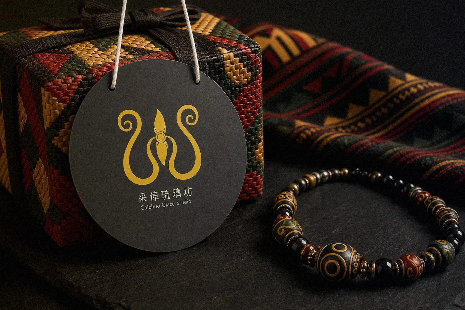
Howdy Creative redesigned the packaging for indigenous products from Pingtung, reinterpreting the goods with tribal patterns and colors so local products stand out with greater shelf recognition and market competitiveness.
Challenge
Indigenous products from Pingtung carry tribal culture and real production stories, but the existing packaging had room to grow in shelf recognition and information clarity, making it hard to catch a shopper's eye on shelves or e-commerce pages. The redesign had to bring in tribal culture appropriately while staying workable for actual printing and production.
Goal
Build a packaging system that balances cultural meaning with market recognition, translating tribal patterns and colors into the packaging appropriately, avoiding a pile of decorative motifs, while staying within real printing and production constraints.
Approach
- Audited the existing packaging's shelf recognition and information completeness, pinpointing where shoppers were most likely to overlook or misread it.
- Studied the cultural meaning behind tribal patterns and colors, selecting elements that genuinely represented the local story rather than piling on decoration.
- Redesigned the product's visual layout and information structure using a contemporary approach, balancing aesthetics with readability.
Outcome
The packaging redesign for these Pingtung indigenous products is complete, reinterpreting the products with tribal cultural elements and delivering a design solution that balances cultural recognition, readability, and production feasibility, ready for production.
- Year2024
- ClientPingtung indigenous community producers (屏東在地原住民商品)
- ServicesPackaging Design