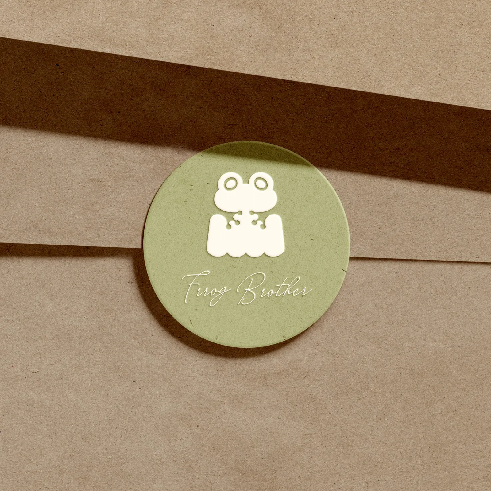
Frog Brother Bakery's Brand Identity Evolves: A Consistent Look from Logo to Packaging
Frog Brother Bakery's handmade canelés already had a following, but the brand still looked like a personal side project. Howdy Creative redesigned the logo and packaging so the canelés could carry the identity of a proper patisserie brand.
Challenge
Frog Brother Bakery's handmade canelés had built a solid following, but as the brand began looking toward the premium dessert market, its existing look and packaging still read as a casual, personal-brand style. That made it hard to convey the value a canelé line deserved, and left customers unclear on where the brand actually stood.
Goal
Redesign Frog Brother's logo and visual system, then extend it into dedicated canelé gift box packaging, so the brand communicates patisserie-level quality through form, color, and material. The aim was to create clear separation from ordinary bakeries and let customers immediately recognize the brand's step up in positioning.
Approach
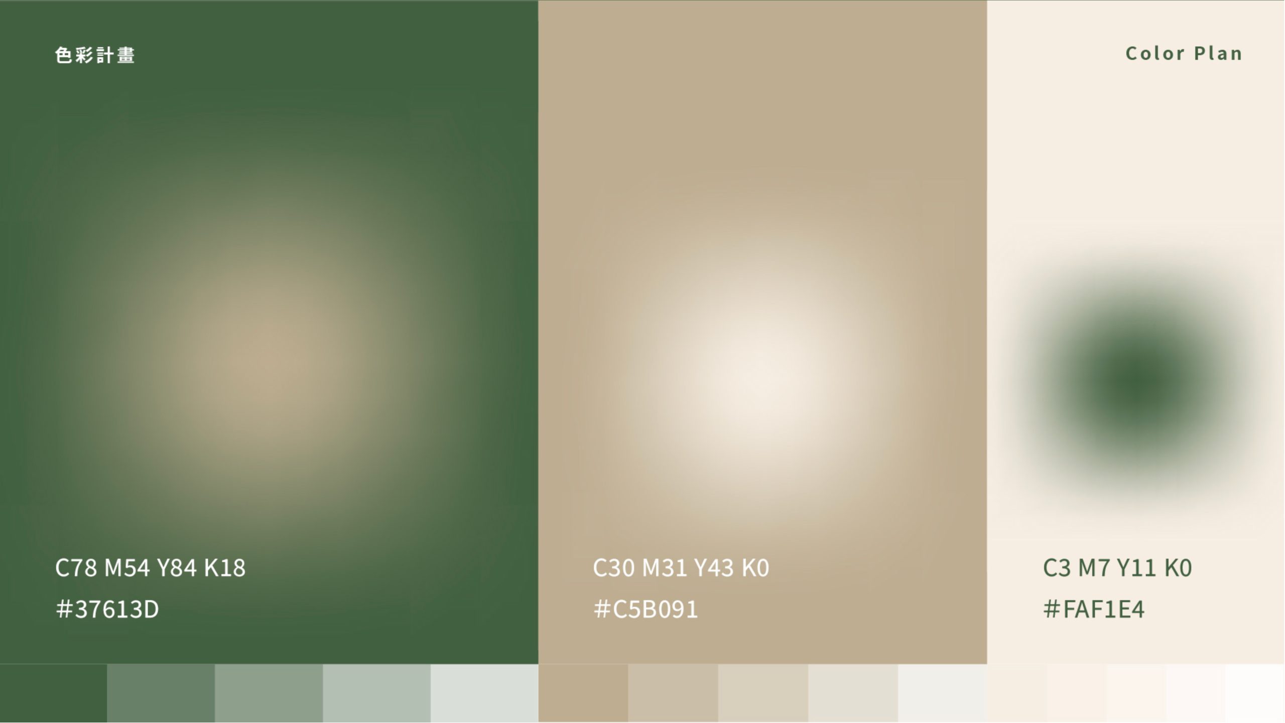
- Redesigned the logo with cleaner lines, replacing the previous casual look and unsystematic color choices with a more professional first impression.
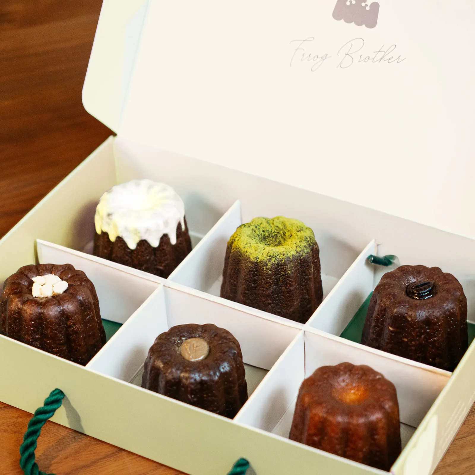
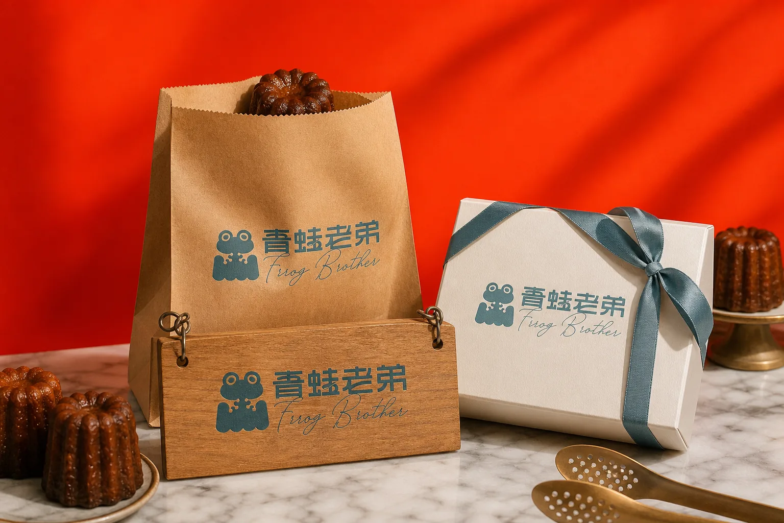
- Developed dedicated gift box packaging for the canelés, where material choices and craft details echo the positioning and quality a premium dessert deserves, turning the box itself into a marketing asset.
- Extended the identity to business cards and a signature stamp, unifying the tone across every customer touchpoint and carrying the premium positioning through consistently.
Outcome
Frog Brother completed a new logo and canelé gift box packaging, carried through to applications like business cards, giving the brand a consistent identity across visuals and packaging that matches its premium dessert positioning, and leaving room to extend the system as it opens future locations.
- Year2025
- ClientFrog Brother Bakery (青蛙老弟烘焙坊)
- ServicesBrand Identity